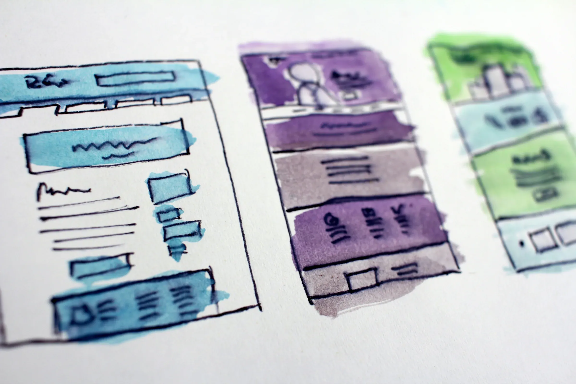
The default behaviour in digital design is addition. A new section. Another feature. One more call to action. Each addition seems reasonable in isolation. But collectively, they create friction: decision fatigue, visual noise, cognitive load that the user pays with attention and the business pays with conversion.
Complexity is the default. Reduction is the discipline.
It takes restraint to not add. It takes clarity about the goal to know what the goal isn't. Most digital products accumulate complexity the way organisations accumulate process: incrementally, defensively, without ever asking whether the whole is still coherent. The result is a product that works, technically, but demands too much of the user. Every unnecessary element is a tax on attention. And attention is the scarcest resource in digital experience.
"Complexity is the natural state. Reduction is a decision."
Reduction as strategic advantage
The most trusted digital experiences in any category are almost always among the simplest. Not because simplicity is a trend, but because it's a signal of competence. A product that doesn't overwhelm you is a product that understood what you needed. That understanding is rare. When users feel it, it creates disproportionate trust. Restraint, in digital experience, is a competitive position.
How friction accumulates
Friction rarely arrives in single large moments. It accumulates. A form with one unnecessary field. A navigation with one extra tier. A page that takes three scrolls to reach its point. Each is minor. Combined across an entire user journey, they represent the difference between a conversion and a bounce. Mapping the accumulation of friction is one of the most valuable things you can do for a digital product, more valuable than most visual redesigns.
"Friction compounds. So does the cost of ignoring it."
Decision fatigue and conversion
The more choices a user is asked to make, the less likely they are to make the one you want. This is not speculation. It is a consistent pattern in UX research and commercial performance data. Every additional call to action dilutes the primary one. Every optional field increases form abandonment. Every additional product page competes with the one that should be converting. Reducing decision load is not minimalism for its own sake. It's conversion engineering.
The discipline of saying no in design systems
Design systems often become complexity machines precisely because they're built to be comprehensive. But comprehensiveness is not the goal. Coherence is. A design system that includes every possible component will produce inconsistent experiences at the edges. A design system built around constraints, that has decided what it won't do, produces consistent experiences everywhere. The discipline of exclusion is what makes systems scale without degrading.
"The best design systems are defined as much by what they exclude as by what they contain."
Every project we take on at Reforma starts with a reduction exercise: what is the fewest number of things this experience needs to do well? Not the most. The fewest. From that clarity, we build. What you end up with is not a minimal product. It is a precise one. And precision converts.
See reduction in practice with the Farae eCommerce platform, an experience engineered to feel effortless, with every unnecessary element removed so that what remains converts.
Start the conversation →